We all realize the news media can be a good source of information but only rarely is it the place I go for perspective, unless it is an editorial section like the Durham Herald-Suns’.
A good example is how apprehensive we’ve been over the nuclear reactors in Japan without having a clue how to compare it with other sources of energy.
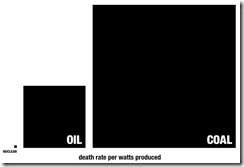
Here is the data, here is a full illustration, here and imaged in this blog is a simplified version that appeared in Seth Godin’s blog on Tuesday. You’ll need to click on the link above or the image to see the point.
So for every person killed by nuclear power, 4,000 die from coal power generation.
Durham is between two counties, one to the south, where Raleigh is located, is home to a nuclear power plant, another in the county north has a plant powered by coal.
Hmmm? 4,000 to 1 and I wonder which one I should be more concerned about. And why am I not hearing a drumbeat in the local news about the coal fired plant?
Seth Godin, by the way, is a best-selling author on marketing and also an entrepreneur, His is one the blogs I follow, but that shouldn’t be a surprise to anyone involved in community/destination marketing as I was for nearly four decades until I retired back in 2009.
By the way if you didn’t open this link to the Herald-Sun in the first paragraph, you missed a great cartoon about the bravery of the staff that stayed with the troubled reactors in Japan!
No comments:
Post a Comment