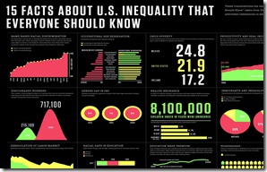
Yesterday, I spotted an infographic on the Objects In Repeat blog while searching for a study released by the Stanford Center for the Study of Poverty and Inequality.
The Stanford Center had made 20 charts easily accessible from the report. But click below on Kristy Tillman’s inforgraphic on Objects In Repeat to see an example of how to make this information really pop. I also just noticed she made Fast Company’s blog today as well. (click on the graphic below to enlarge)
One that really grabbed me is in the lower, right corner. A few years before I graduated from college in 1972, CEO pay was 39 times the average workers pay. The year before I came to Durham, it was 191 times. By the turn of the century, it was 1039 times.
Another part of the infographic illustrates that all of the discrepancy isn’t just due to an increase in CEO comp, a big part is the stagnation in overall income over the last several decades.

No comments:
Post a Comment