I was only 40 years old when I interviewed 25 years ago this month to jumpstart demand-driven economic and cultural development for Durham, North Carolina, where I still live, though long retired.
H.C. Cranford, a retired PR executive for Blue Cross-Blue Shield of North Carolina, was the chairman of the governing board that brought me on board as CEO.
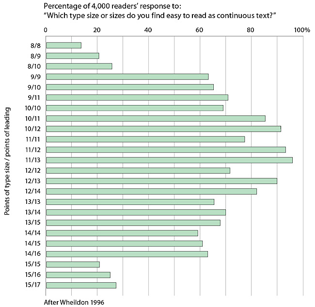
He gave me advice never to let the font size in DCVB’s publications and other marketing materials go under a certain size.
We affectionately called it “geezer type” and made it a policy. Although it would be nearly another decade before I had to wear glasses, it made sense to me. It was just good marketing, and H.C. loved the term.
H.C. was a true southern gentleman who had been inducted into the North Carolina Public Relations Hall of Fame the year I arrived. Born in Mobile, Alabama, he had a soft accent that reminded me of Lindsey Nelson, a Tennessean who called Notre Dame football games in the 1960s as well as the famous 1969 World Series.
Mr. Cranford passed away five years before I retired but there isn’t a day he doesn’t cross my mind with a smile because increasingly I am aware of how unfriendly some type sizes are.
In fact, Nielsen reported recently in a paper entitled Respecting Elders Is Good Manners, But Better Business that this problem will only become more significant for retailers, manufacturers and marketers.
According to the World Health Organization, the over 60 market will grow to 2 billion people worldwide by 2050, just a bit more than three decades from now.
I already find that product and clothing labels and the fonts on some smartphone apps such as USA Today (which for some reason does not respond to enlargement) difficult to read at certain times of the day or in certain lighting.
Because I have my eyes checked by an Ophthalmologist at Duke Eye Center once a year and wear glasses, I know this is pretty normal.
According to strategists at A.T. Kearney, the over 60 market is projected to spend $15 trillion annually by the end of this decade. That’s a lot of consumer consumers and buying power to leave behind due to type that is too small to be read.
By the way, 12 point type size and above, depending on the font, is what is readable for “geezers.” These days, I’d argue for 14 point type size, and I can imagine H.C. nodding approval.
No comments:
Post a Comment